Flovate.ai
An AI-powered business automation platform · KSA
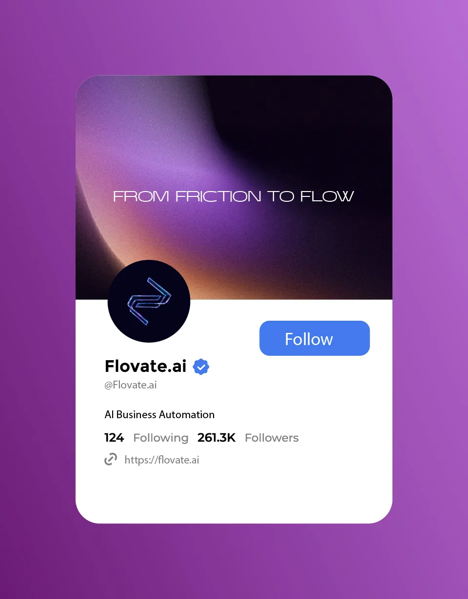
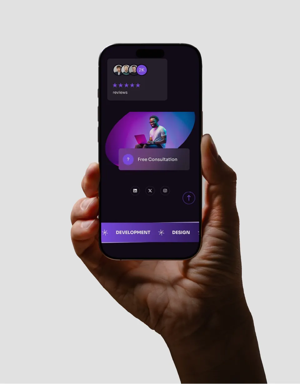
Not every business needs more tools. Sometimes, it needs less friction.
Flovate.ai is a platform that simplifies complex business workflows with AI-powered automation. This project took it from strategy and naming to a complete visual identity system, and the story below follows the four steps I use on every brand.
Systems that don’t flow.
The starting point was a simple observation: businesses don’t struggle because they lack systems. They struggle because those systems don’t flow.
As operations grow, complexity grows with them. Disconnected tools. Manual processes. Constant friction. That friction, more than any missing feature, was the problem the brand had to speak to.
A partner, not a tool.
Flovate.ai rethinks that system, turning rigid workflows into adaptive, intelligent flows. So we positioned it not as a tool, but as a partner in simplifying complexity and enabling growth.
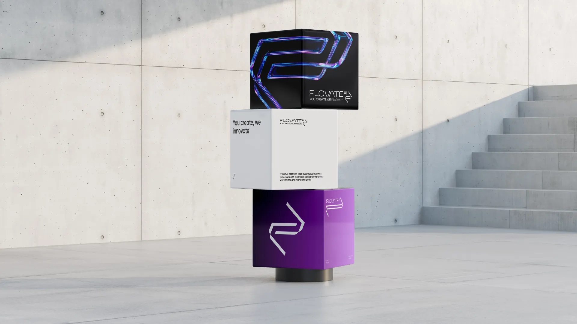
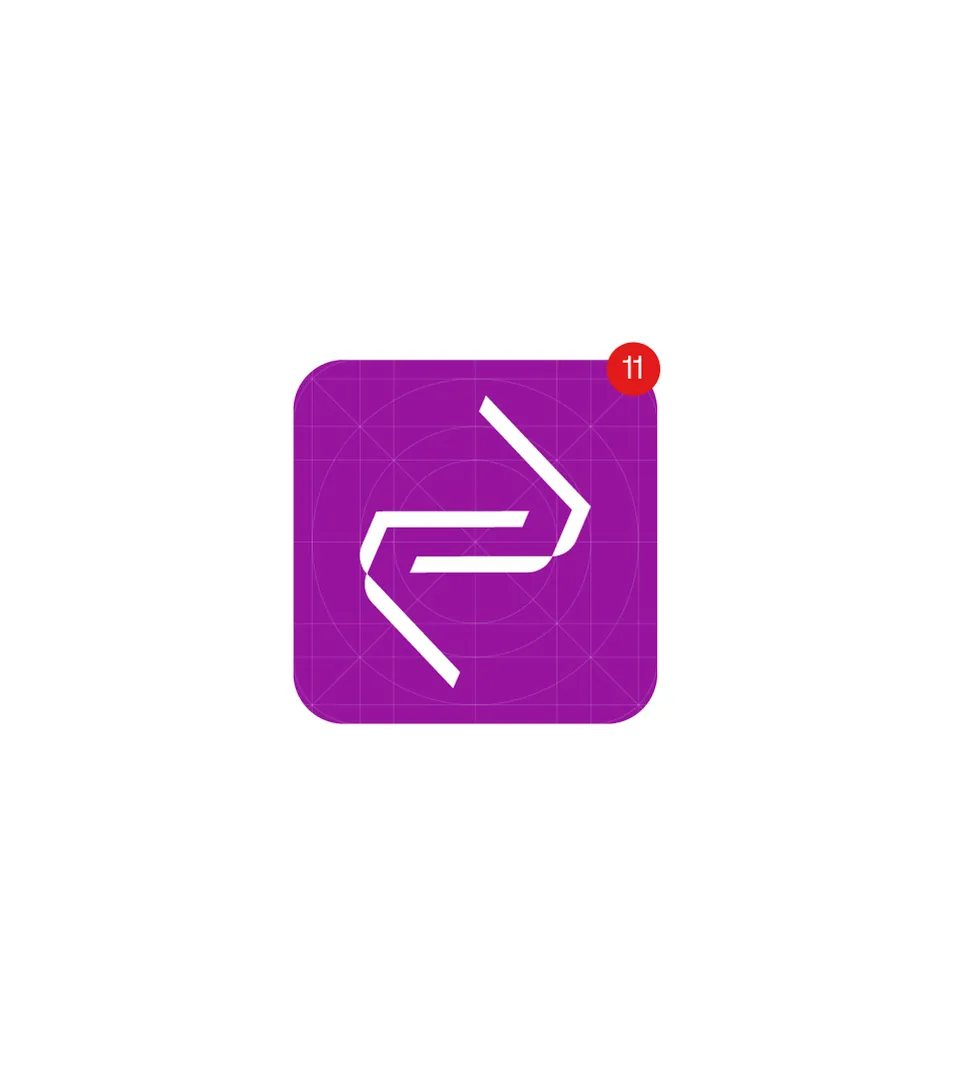
From there we worked on the name and the brand concept, and on the logo itself. The mark reflects interaction: a balance between human input and machine intelligence. It is not static. It responds, adapts and moves forward.
From friction to flow.
The story the brand tells is a movement from one state to the other. The identity doesn’t represent automation as machinery. It represents it as movement: continuous, seamless and alive.
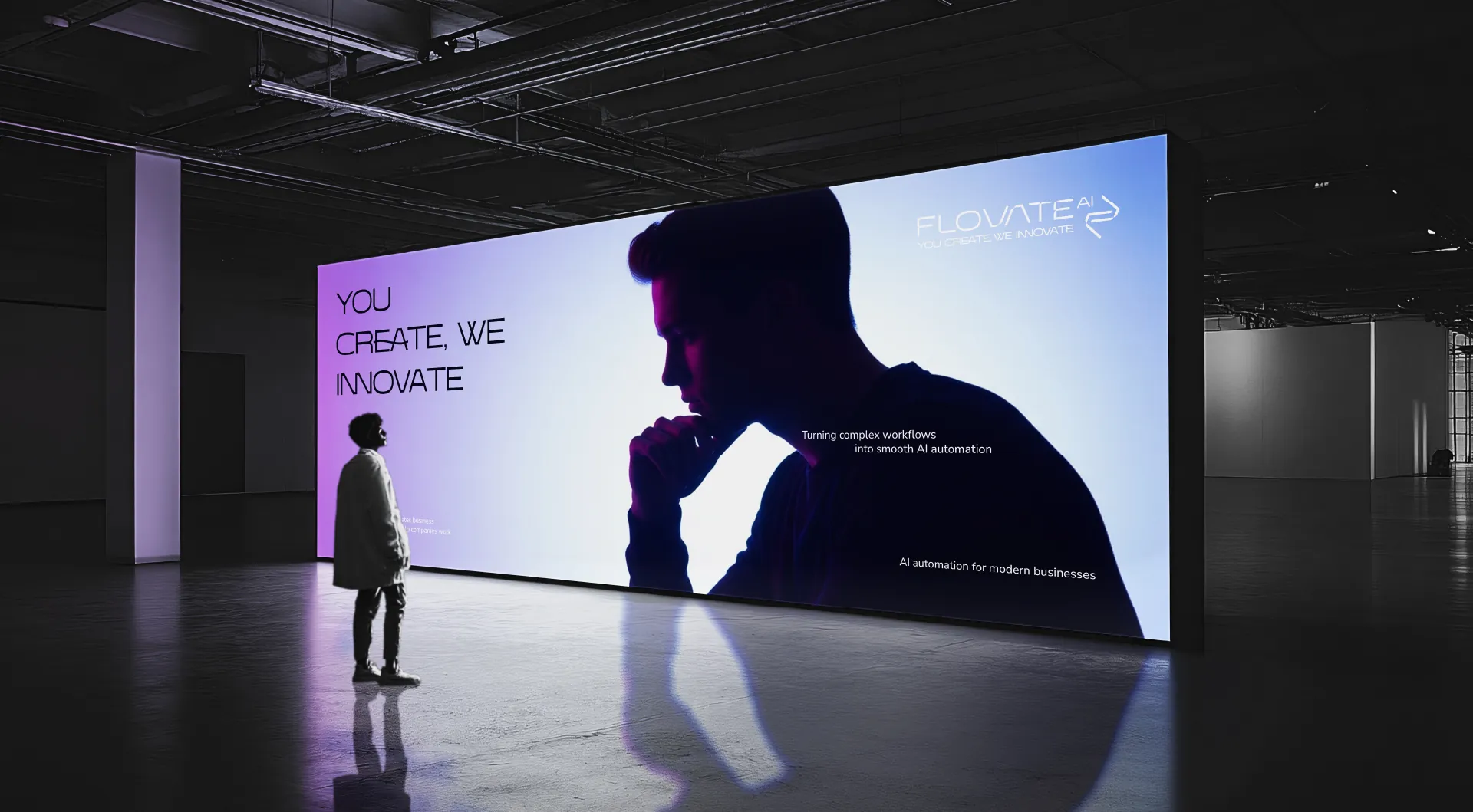
The result is a brand that doesn’t just represent AI, it behaves like it. Adaptive. Precise. Seamless. That idea carries into the line the brand speaks with: You create, we innovate.
Nothing feels fixed.
The visual language is built around fluidity, and each decision follows the same logic as the system it represents:
- Gradients that shift rather than sit still.
- Forms that move instead of contain.
- Light that transitions instead of divides.
Nothing feels fixed, because the system isn’t. Motion is part of the identity, not an addition to it.
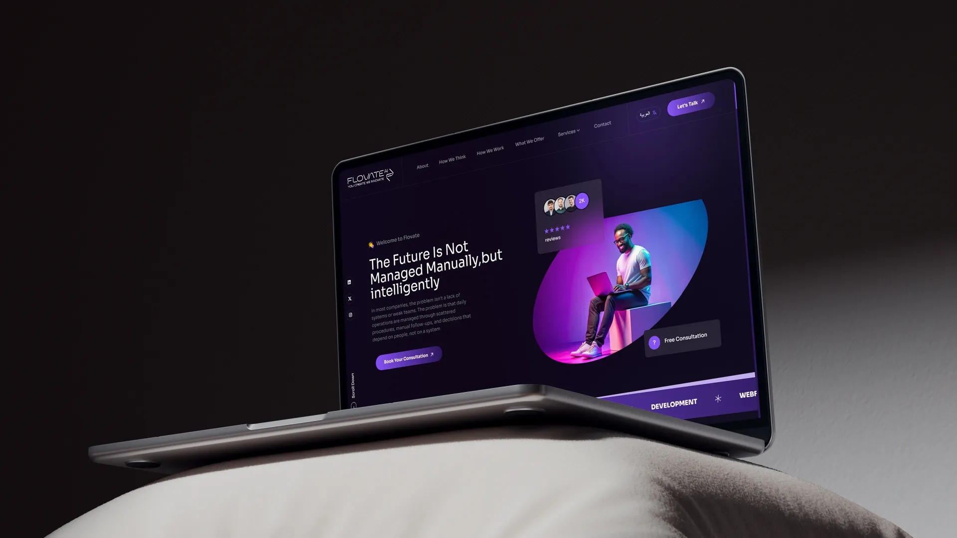
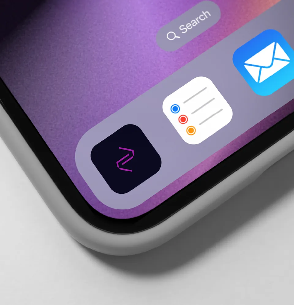
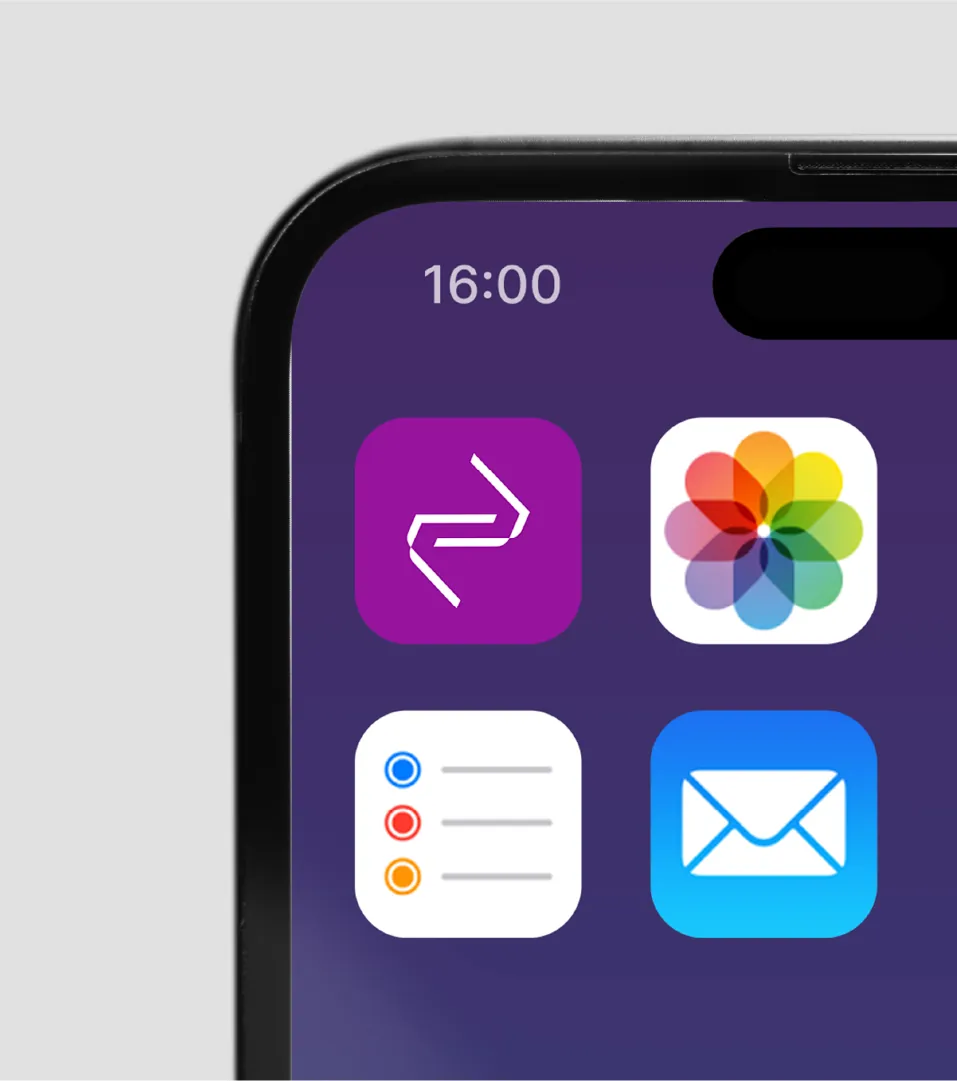
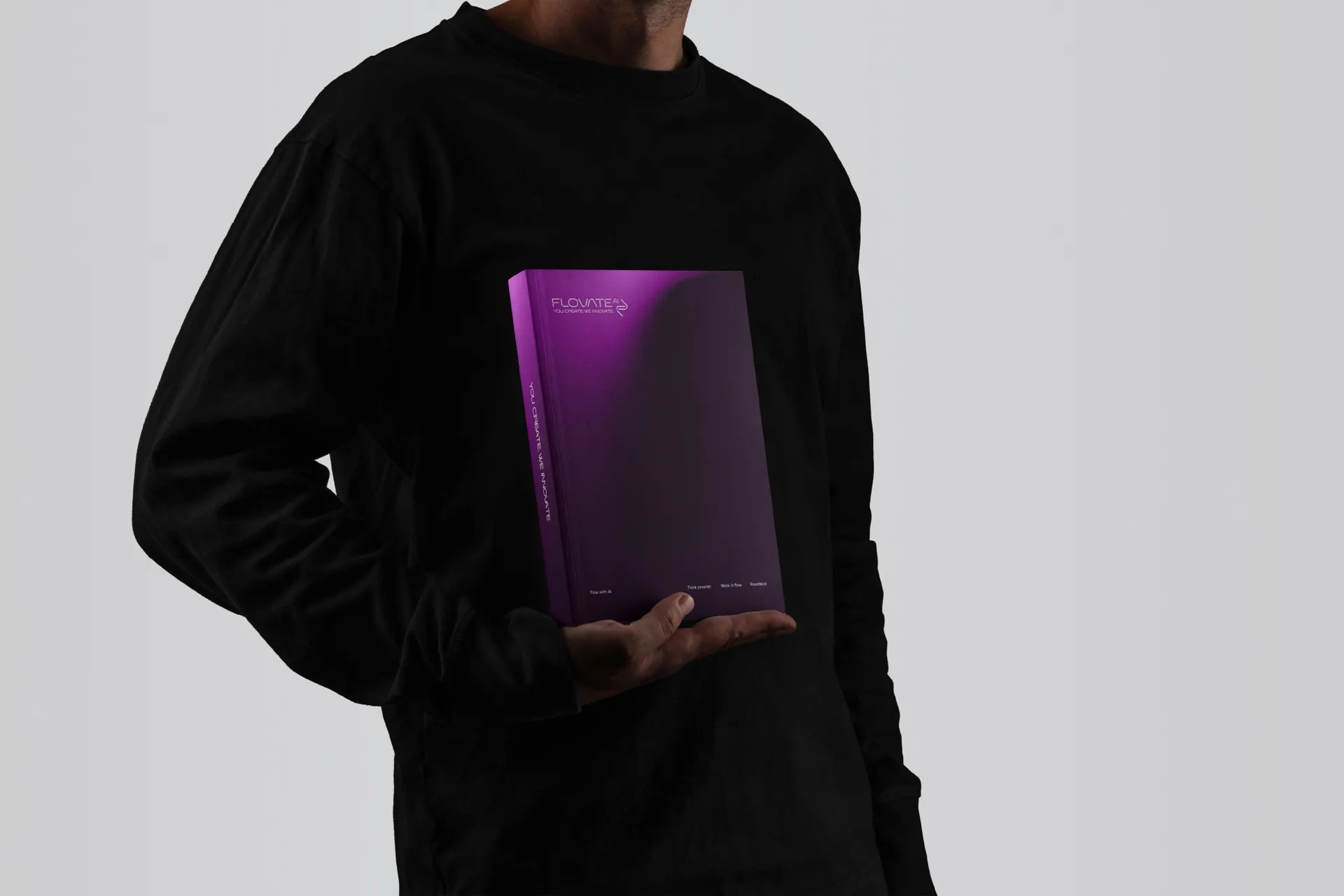
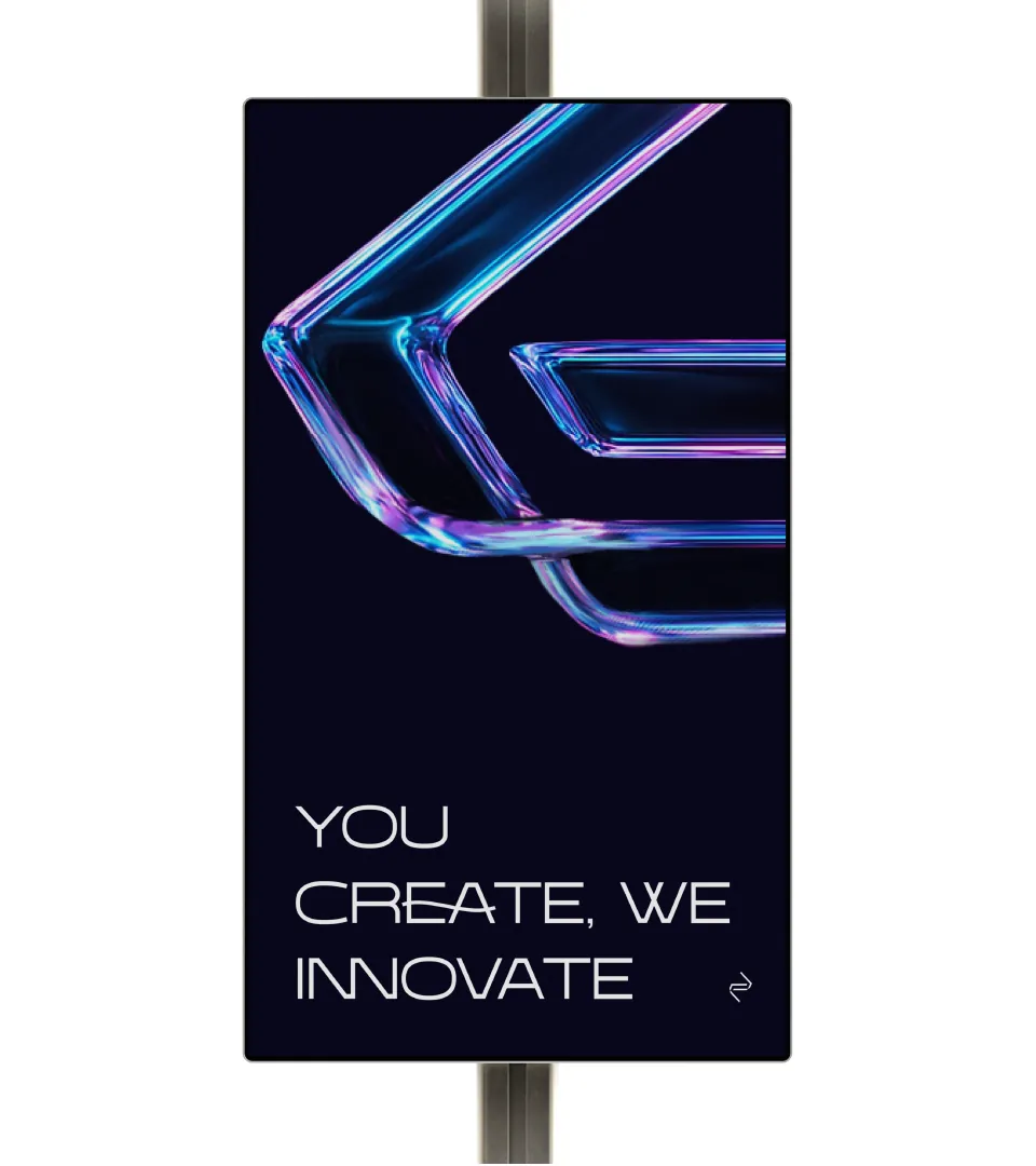
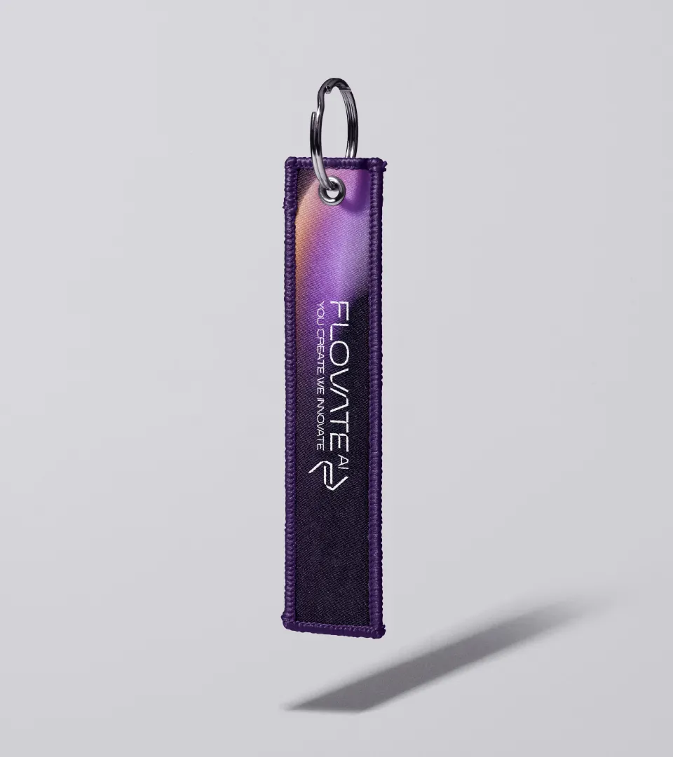
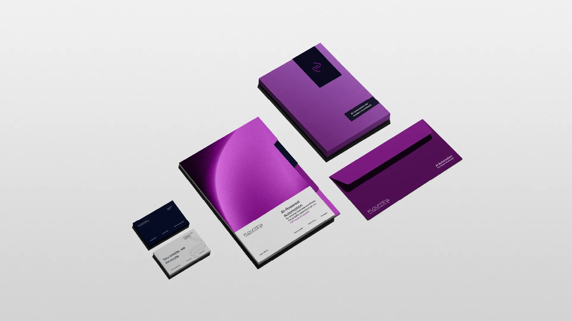
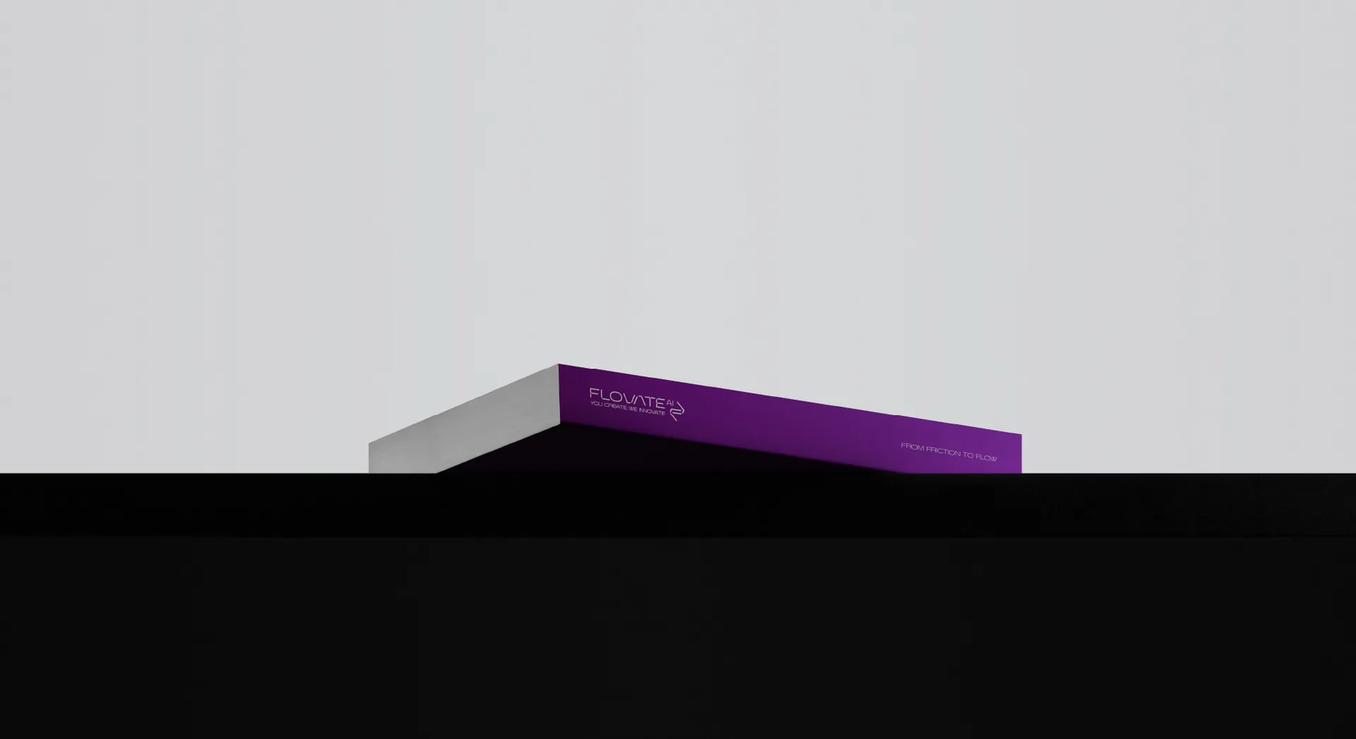
Across the places people meet it.
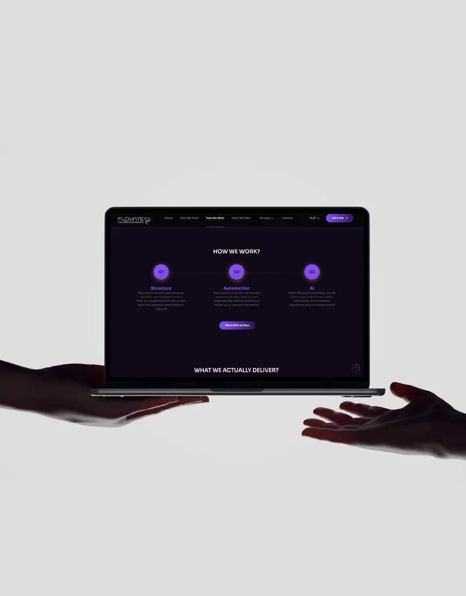
Made together.
- Lead Brand Strategist & DesignerAbdelrahman Khairy
- Presentation DesignOmar Abdallah
- Motion DesignAbdulrahman El Refaaey
Brand names, logos and visuals belong to their owners.

Have a brand story worth telling? Let’s tell it well.